
Website design and UI/UX services
FyerX designs websites around the decisions visitors come to make. We map the service architecture, write or structure page content, prototype critical journeys and define the components a development team needs to ship a coherent experience.
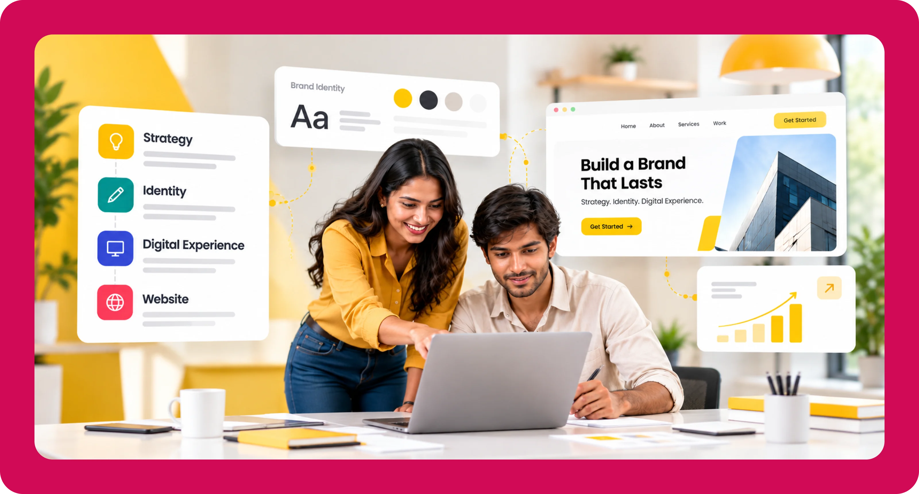

When to bring in FyerX
Consider website & ui/ux when you are dealing with a site with attractive pages but confusing navigation or weak enquiries. Our starting point is a clear user journey. We work with the digital product owner to establish what evidence is available, what decision depends on it and which improvement the team can realistically put into practice. The first scope defines a tested website design system and the way your team will judge its usefulness.
Information architecture
We start with existing content, analytics and user questions. The immediate task is to build a navigation and URL structure around recognisable buyer language. Watch a visitor who knows the product name try to locate the relevant page. Their route often exposes a mismatch between internal navigation labels and the words used to specify a requirement.
Interface design
For interface design, the starting material is brand assets, task flows and device requirements. We prototype responsive layouts, forms, states and reusable components. Specify the empty, loading, validation and confirmation states alongside polished screens. Those states determine whether people understand what happened when a form, search or booking journey runs into difficulty.
Content and conversion
Build page briefs around unique decisions. An enterprise platform overview should help visitors choose a service, while an implementation detail page should explain scope, evidence and the path to an enquiry. We use service evidence, search intent and enquiry requirements to make each page explain the offer, answer objections and support a next action.
Handoff and release
Include the people who will publish after launch in acceptance testing. Ask them to update a service, replace an image and preview a mobile layout using the actual editing workflow. The work draws on development constraints, CMS needs and acceptance tests. With that in hand, we specify interaction states, accessibility expectations and content ownership.
Illustrative engagement
Help buyers find the right specialist service
Starting point
The navigation groups capabilities by internal team names that new visitors do not recognise.
Decision
Map the questions buyers bring, test alternative navigation labels and prototype the path from service discovery to enquiry.
Deliverable
A tested page architecture with responsive layouts and handoff specifications.
A typical brief
A buyer knows the name of the platform they need but finds the service hidden under a generic menu category. A clickable service route, recognisable heading and relevant proof can solve more than another decorative homepage animation.
Plan for the content that changes after launch
A website frequently changes through small editorial updates rather than major redesigns. A team member adds a longer service heading, publishes a new case example, updates a contact route or removes an obsolete offer. Check how the content model handles those normal changes. Where is the source of truth for a service name that appears in navigation, breadcrumbs and related links? Who controls whether an old route redirects or remains available? Can an editor see which cards depend on the image they are replacing? Include realistic editing exercises in acceptance. Use the same header and footer that visitors will see and ensure responsive behaviour still works with actual text. Give the content team practical limits, such as image aspect ratios and what belongs in a short summary, together with a preview route. A good design system creates enough consistency for routine updates while leaving room for a complex service, a long customer name or an unusual buyer question. That flexibility is part of the ongoing value of the website.
Test the route a buyer takes after landing from search
Give a participant a service detail URL rather than starting them on the homepage. Ask them to explain what they could buy, whether the provider looks suitable and which link they would use to discuss scope. Observe the words they use. If they describe the work differently from the menu label, the problem may be information architecture even when the page looks polished. For a technical buyer, include a second task such as finding the difference between a project engagement and a staff augmentation request.
Repeat those tasks on a narrow screen with a keyboard and with the site menu closed. Check that form labels stay visible after a value is entered and that an invalid field tells the visitor how to recover. Record each failure against a screen, a task and the point at which the participant stopped. The design handover should identify the corresponding component state and content owner. That gives developers a concrete acceptance test when they implement the next service page.
Prove that the navigation works on a buyer’s real task
Choose a service that is important to sell but difficult to find on the current website. Give a prospective user a realistic task, such as finding out whether an existing enterprise platform can be supported after launch and contacting the right team. Observe which menu label they select, which page they expect to see, what evidence they need and where they hesitate. The design brief should distinguish a naming problem from a missing page, confusing layout or broken interaction. We build the route across navigation, service detail, proof and enquiry in a prototype that can be tested on a small screen as well as a desktop. The component specification covers keyboard focus, mobile menu behaviour, long headings, image treatments, form validation and confirmation states. Where sales routes enquiries to different teams, the destination is part of the design decision. For acceptance, trace the task through a working implementation using the same labels and service content a customer will see. Check back navigation, direct links, meaningful heading order and whether an error can be recovered without losing entered data. The handover should let a developer implement the next service page and a content editor populate it without inventing new layout rules. We record any remaining dependency, including a missing case study, CRM destination or policy statement, with a named owner and clear release consequence. Recheck that route when the menu changes.
Prototype a buyer’s shortest useful route
Pick a visitor who arrives directly on a specialist service page. Can they confirm the scope, find related evidence and reach the right enquiry form without returning to the homepage? Then try the same task through the mobile menu and site search where available. Differences expose information architecture issues that a static homepage review misses. Include one visitor with incomplete information, such as someone who knows the business problem but cannot name the platform. A good website supports both the expert buyer and the person still narrowing the requirement.
Protect content during component design
A card with sample text might look balanced while the real service title wraps awkwardly or pushes the action out of view. Use actual headings, questions and case material in important prototypes. Agree image behaviour, long-text limits and accessible interaction states before implementation. This reduces the need for manual fixes when editors add the next service.
Design from the service detail outwards
A buyer who finds a specialist page directly through search may never see the homepage. The detail page must identify the business, explain the service and give a credible route to the next step. Check how header, breadcrumb, related proof and contact destination behave together. This matters as much as the first impression of the homepage itself.
Make a publishing rehearsal part of acceptance
Ask an editor to create a new page with the intended content model. Watch which fields are unclear, which image crops break and where the layout relies on a designer to repair it. A successful rehearsal produces a working page and an improved editing guide. It also exposes maintenance costs before the site is handed over.
What to expect from information architecture
For information architecture, ask for a sitemap, content model and navigation prototype. Use it with existing content, analytics and user questions to examine a real decision. The issue it needs to prevent is creating category labels that only make sense internally. A reviewer should be able to trace a recommendation back to the source, explain where an exception belongs and say who takes the next action. Agree with the digital product owner which decisions they can make directly and which ones need another team.
What to expect from interface design
The output is a design system and clickable journey. To review it, pick an example drawn from brand assets, task flows and device requirements and ask the person responsible to prototype responsive layouts, forms, states and reusable components. If the example ends up approving desktop mockups without mobile or error states, examine the point where the decision became ambiguous. Capture the reason for any exception and incorporate it into the next version. This exercise tests whether the work can be operated by the people who inherit it.
What to expect from content and conversion
Before accepting page briefs and conversion patterns, look at a borderline case. Use service evidence, search intent and enquiry requirements to identify when a routine recommendation could lead to burying important service scope beneath generic claims. Ask the reviewer to describe the appropriate next step in their own words. A workable design lets another colleague reach a consistent decision using the same evidence, or makes the remaining judgement explicit enough to discuss.
Planning your engagement
What to expect from handoff and release
Under handoff and release, the deliverable is developer handoff, QA checklist and publishing guidance. Review an ordinary case and one that could result in shipping an interface the client cannot update. Compare both with development constraints, CMS needs and acceptance tests and confirm the owner can specify interaction states, accessibility expectations and content ownership. Record any change to the operating assumptions with the deliverable so later results can be interpreted against the approach actually used.
How to evaluate the work
Track successful completion of priority website tasks. Keep the starting point and reporting period beside the observed result. If the digital product owner changes how the team qualifies a clear user journey, report the change alongside the figures. The useful comparison is between groups that entered under comparable conditions. A shift in who qualifies can change the reported percentage even if the underlying commercial performance stays the same. Review representative examples as well as the aggregate.
What to bring to a scope discussion
Bring an example that illustrates a site with attractive pages but confusing navigation or weak enquiries. Share the current version of existing content, analytics and user questions and explain how the team handles content and conversion today. Describe who needs to use a tested website design system and what is already scheduled that could affect delivery. With that context, FyerX can distinguish the immediate work from later enhancements and identify the access, evidence and approvals needed for a credible estimate.
Frequently asked questions
Website & UI/UX
Do you design for the existing CMS or recommend a new one?
We review the current editing workflow and technical constraints first. A clearer information architecture or component library can often solve the problem. A platform change needs its own business case.
What is the difference between UX and UI work?
UX defines what people need to do and how a journey works. UI makes states, hierarchy and interactions legible on the screen. Both contribute to a usable site.
Can we redesign the site without losing organic traffic?
Plan URL mapping, redirects, metadata, content continuity and internal links as part of the release. Monitor priority URLs and form journeys after launch. Search visibility can still fluctuate.
What should be prototyped first?
Start with a meaningful task such as finding a specialist service, comparing options or completing an enquiry. Include an error or alternate route so the design can handle real behaviour.
How do we keep new pages on brand?
Use reusable components, typography rules, image guidance and content patterns. Give editors examples of when each pattern works and where a bespoke layout needs design review.
Will the design work on mobile?
Mobile navigation, content order, touch targets and forms belong in the initial specification. Review representative devices and interaction states as part of acceptance, rather than relying on a scaled desktop layout.
What do we need to start information architecture?
Start with existing content, analytics and user questions. That gives the team enough context to build a navigation and URL structure around recognisable buyer language. If some records are incomplete, identify which decisions they affect and agree a sample that can still be checked. Capture the missing evidence in a sitemap, content model and navigation prototype.
How do we review interface design?
Ask to see a design system and clickable journey applied to a real example. Compare the recommendation with brand assets, task flows and device requirements and discuss what would cause the team to change it. One warning sign is approving desktop mockups without mobile or error states.
Who should be involved in website & ui/ux?
Include the digital product owner, the people who maintain existing content, analytics and user questions and someone who will use page briefs and conversion patterns. Keep review responsibilities close to the decisions each person can actually make. That reduces rework when the project moves from planning into operation.
How is success measured for website & ui/ux?
We suggest beginning with successful completion of priority website tasks. Agree the baseline, reporting period and exclusions with the digital product owner. Include examples from development constraints, CMS needs and acceptance tests so the commercial interpretation is traceable. State any gap that prevents a confident comparison.
What does FyerX hand over for content and conversion?
The scope can include page briefs and conversion patterns. It should describe the inputs, owner, decisions and agreed exceptions. Include a short walkthrough using service evidence, search intent and enquiry requirements so your team can continue the work after delivery.
What determines the scope of website & ui/ux?
The main considerations are the condition of existing content, analytics and user questions, how much of interface design already exists and the level of support needed for handoff and release. We define scope around a tested website design system, with dependencies and acceptance decisions agreed upfront.
 Brand Strategy & Identity
 Social Media Management
 Content Strategy & Production
 Video Production